During the pandemic I’ve seen a rise in people getting hands on with the data and producing a range of different charts to show the number of cases and deaths around the world. It’s rare to have a dataset where data can be collected and reported on a daily basis for this long. So here are some of my favourite chart types that I’ll probably never get to use…
Bar Chart Race
I originally saw this chart being used to compare the most sold video games of all time (Tetris was top for a very long time). However, it is now being used and updated daily to represent the number of cases per country as time moves on. It’s a great way to show how the ranking changes over time along with the data that drives that ranking.
Flower Chart
[OC] The US Coronavirus outbreak to date from r/dataisbeautiful
The amount of data freely available has also inspired members of the public to get hands on. This redditor created a chart showing US cases over time by state. While size and colour are showing the same thing – they compliment each other to highlight where there’s a problem and draw the viewer’s eye.
Sunset / Sunrise Chart

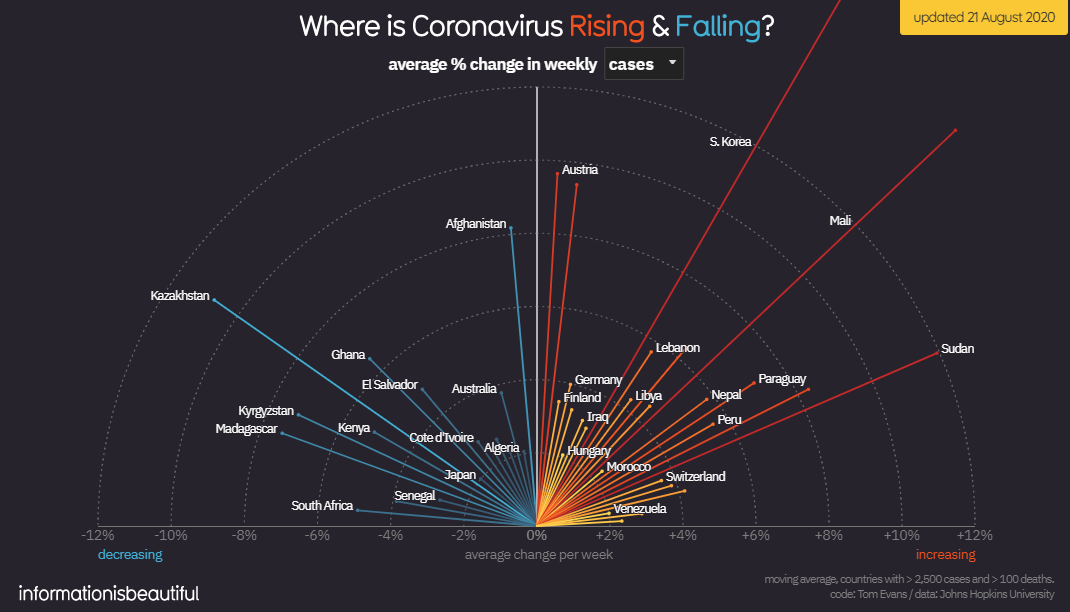
I can’t make a list of charts without seeing what the latest is from Informationisbeautiful.net. This Sunset / Sunrise Chart (I imagine it has a proper name) could have been a bar chart, but with 30 different countries listed it would have looked awful. Charting it around a semi-circle makes the data clearer and more interesting! This one doesn’t have time series data so I might try and use this one once I work out the logistics on PowerPoint…
Music Chart
(sound on for this one)
Sometimes a graph just isn’t enough.
This video is a musical illustration of confirmed Covid deaths. Each country has it’s own tone and blip which builds to an ominous crescendo. In total the video is 13minutes long but it is a powerful watch – turn the sound on and don’t get freaked out.
I'd be interested to hear what one would be your favourite and any new charts or ways of showing this data that you’ve really liked.
Luke Mantell, Sept 20